LerBee
Responsibility
Produce Design · UX Audit · Product Strategy
Scope
End-to-end redesign of the core purchase flow for a live C2C shopping app
Team
1 designer (me) · 2 engineers
Focus
Mobile · iOS · C2C Marketplace
Redesigning the core buying experience for a global C2C live-stream shopping app.
LerBee is a live-stream C2C marketplace where buyers connect with personal shoppers around the world to purchase products in real time. The core purchase flow — from sign-up to checkout to order tracking — had significant usability issues that created friction at every step and undermined user trust.
PROBLEM
Users encountered friction at every stage of the purchase journey: an unfamiliar payment model that required topping up a balance before buying, unexpected steps that broke the natural shopping flow, unclear product filtering, and accessibility issues throughout. The result was confusion, lost trust, and drop-off at the worst possible moment.
UX AUDIT - EXISTING FLOW
I conducted a heuristic evaluation of the existing purchase flow, analyzing each screen against Nielsen's usability heuristics, Fitts's Law, and cognitive load principles. The goal was to identify friction points before moving into redesign.

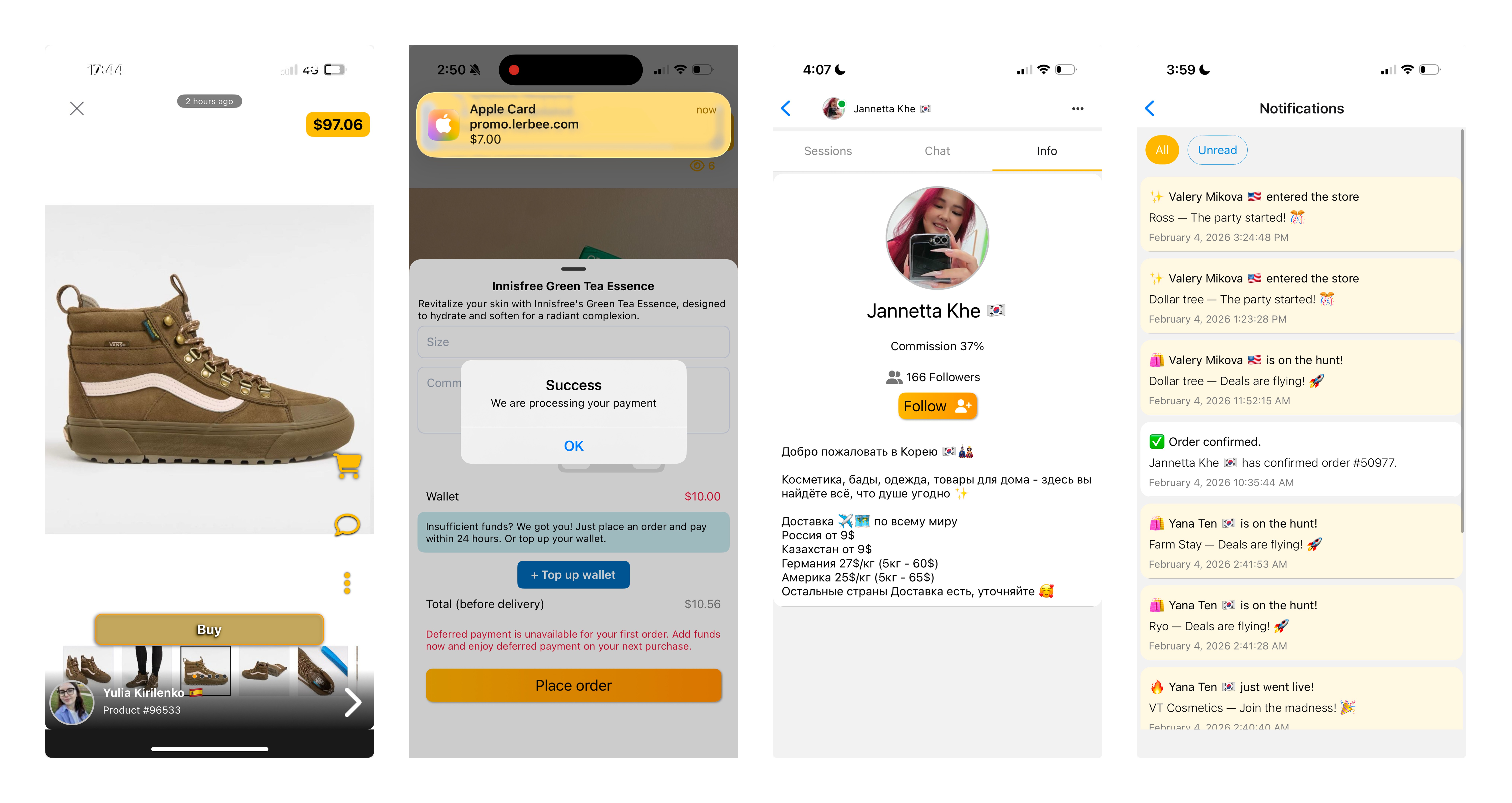
Cognitive Overload & Visual Noise
Cognitive Overload & Visual Noise The onboarding and home screens violated Hick's Law: too many CTAs, colors, and competing elements. The first screen showed both entry points and navigation tabs simultaneously — before the user had even logged in.
Inconsistent UI & Affordance Issues
Buttons across the app had no unified style — orange gradients in onboarding, yellow in top-up, grey in registration. This broke affordance and made it impossible for users to build a mental model of what's interactive.
Broken Checkout Model
The app required users to top up a wallet before completing a purchase — an unexpected step that interrupted the natural buying flow and created unnecessary anxiety at the most critical moment.
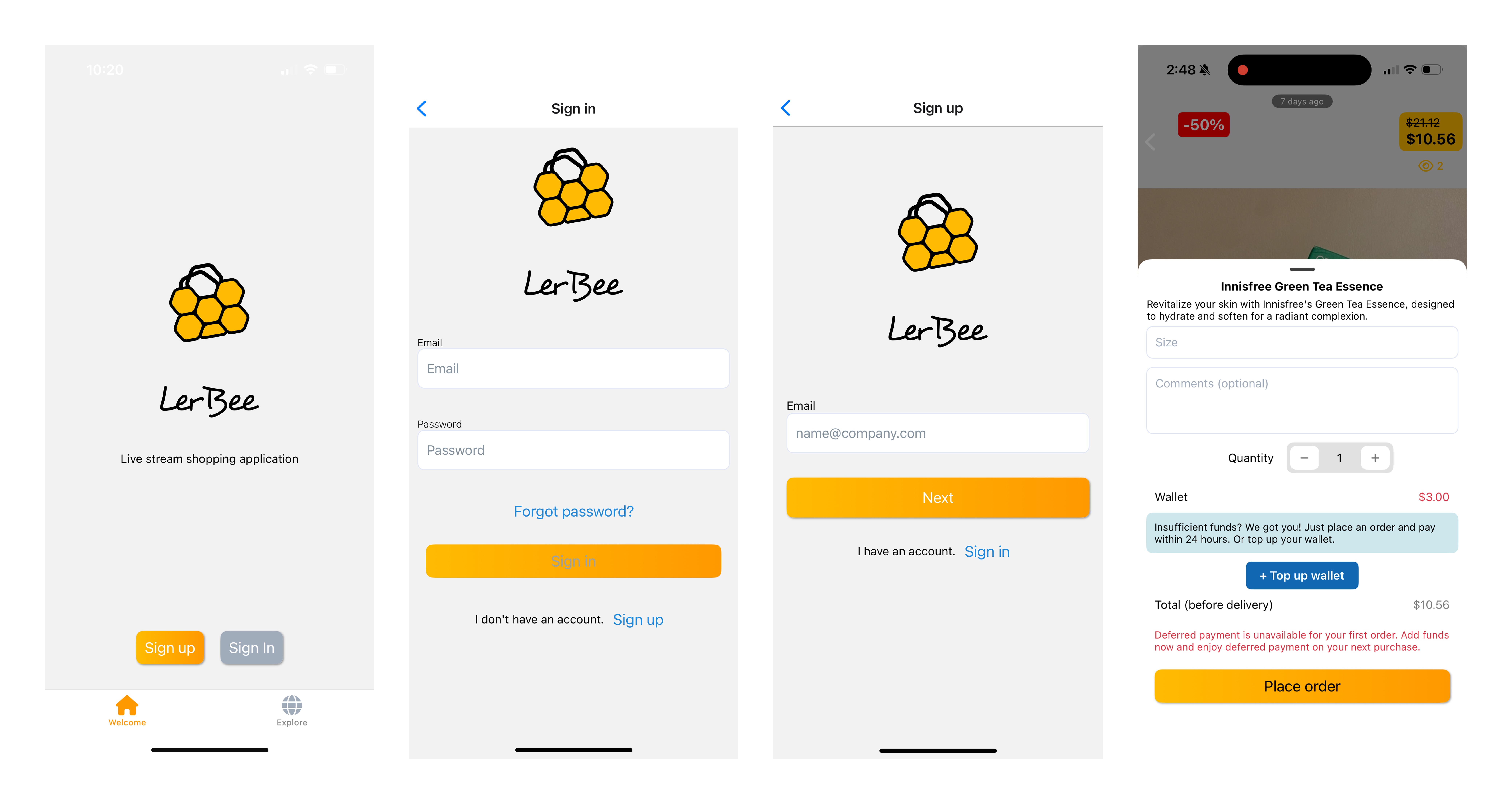
Unclear Pricing Structure
Pricing details were scattered across different parts of the app rather than surfaced at checkout. Users had no clear picture of the total cost before committing to a purchase.
Notification Chaos
Notifications had no visual hierarchy and mixed order updates with promotional content. Users lost track of their purchases with no clear way to find order status.
Weak System Feedback
The language used — "Request" instead of "Confirmed" — added uncertainty at the most emotionally sensitive moment in the flow.
DESIGN DECISIONS - WHAT CHANGED & WHY
The audit revealed a clear pattern: the existing flow asked too much from users at every step — too many choices, too many unexpected obstacles, and too little clarity. The redesign focused on reducing friction, building trust, and making the path to purchase feel natural.
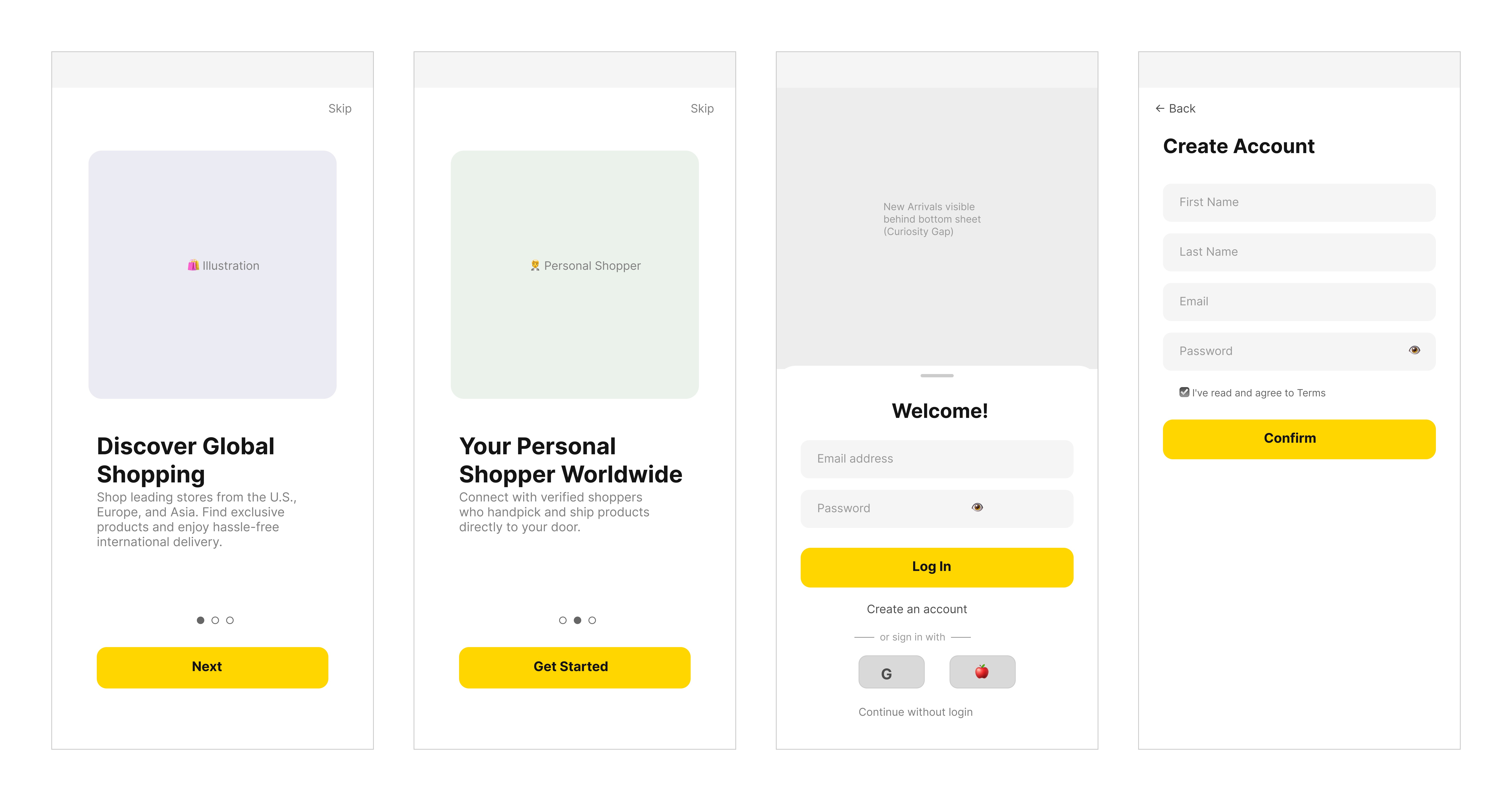
These wireframes represent the structural decisions made during mid-fidelity exploration. Visual details, colors, and final UI are being refined in the high-fidelity stage.
Onboarding — From Chaos to Clarity
Before: Everything was crammed into one screen — sign in, sign up, navigation tabs, and a subtitle that contradicted the app's value proposition.
After: A focused two-step onboarding that communicates the core value — global shopping with a personal shopper — before asking users to create an account. One idea per screen, one action per screen.
Login — Removing Barriers to Entry
Before: Everything was crammed into one screen — sign in, sign up, navigation tabs, and a subtitle that contradicted the app's value proposition.
After: A focused two-step onboarding that communicates the core value — global shopping with a personal shopper — before asking users to create an account. One idea per screen, one action per screen.
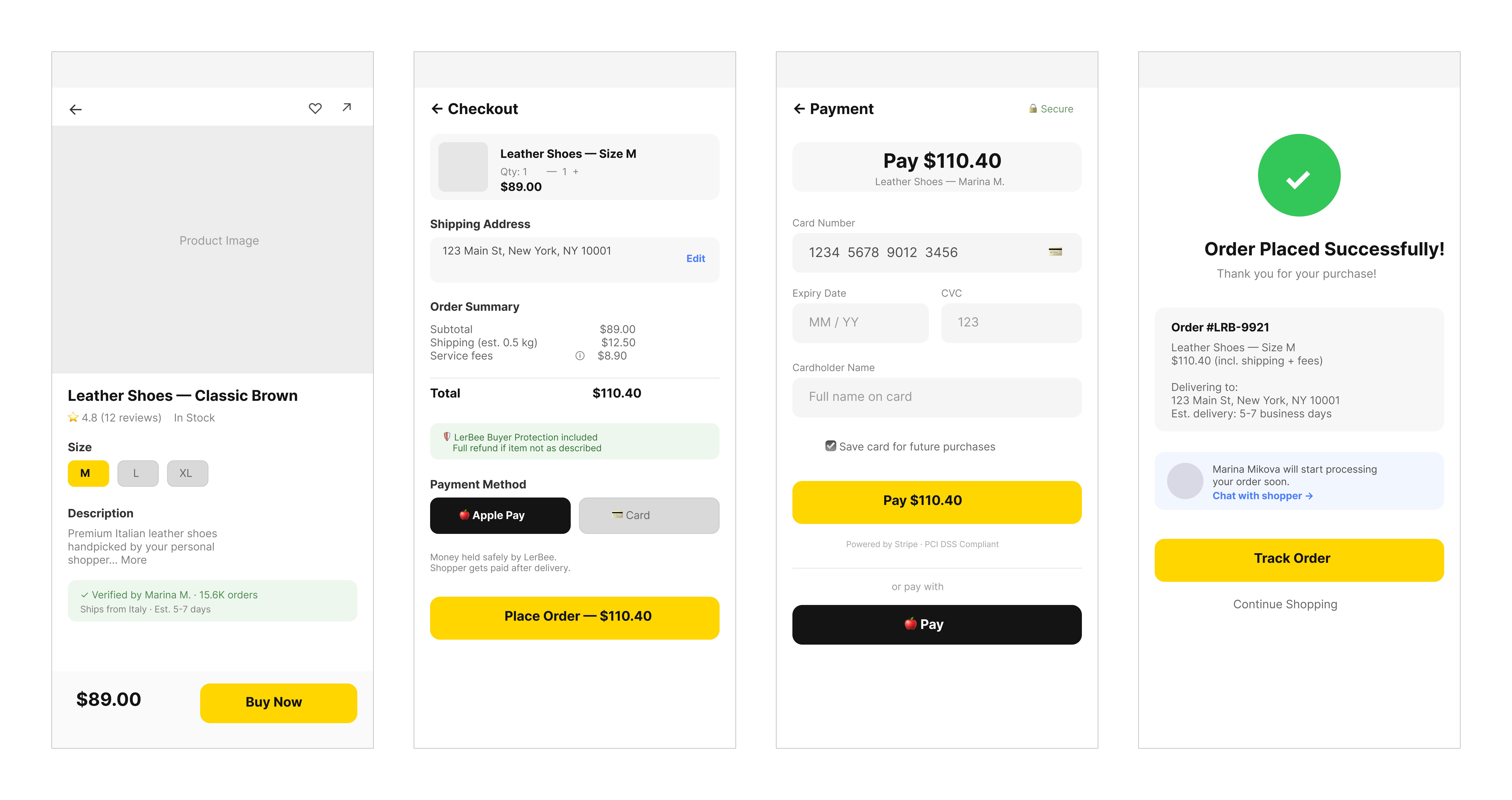
Checkout — From Wallet Confusion to Direct Payment
Before: Users were forced to top up a wallet before paying — an unexpected step that killed conversion. Fees were hidden, terminology was unclear.
After: Direct card payment via Apple Pay or card. Full price breakdown shown upfront — subtotal, shipping, service fees. Escrow model introduced: money held securely until delivery, shopper gets paid only after the order arrives.
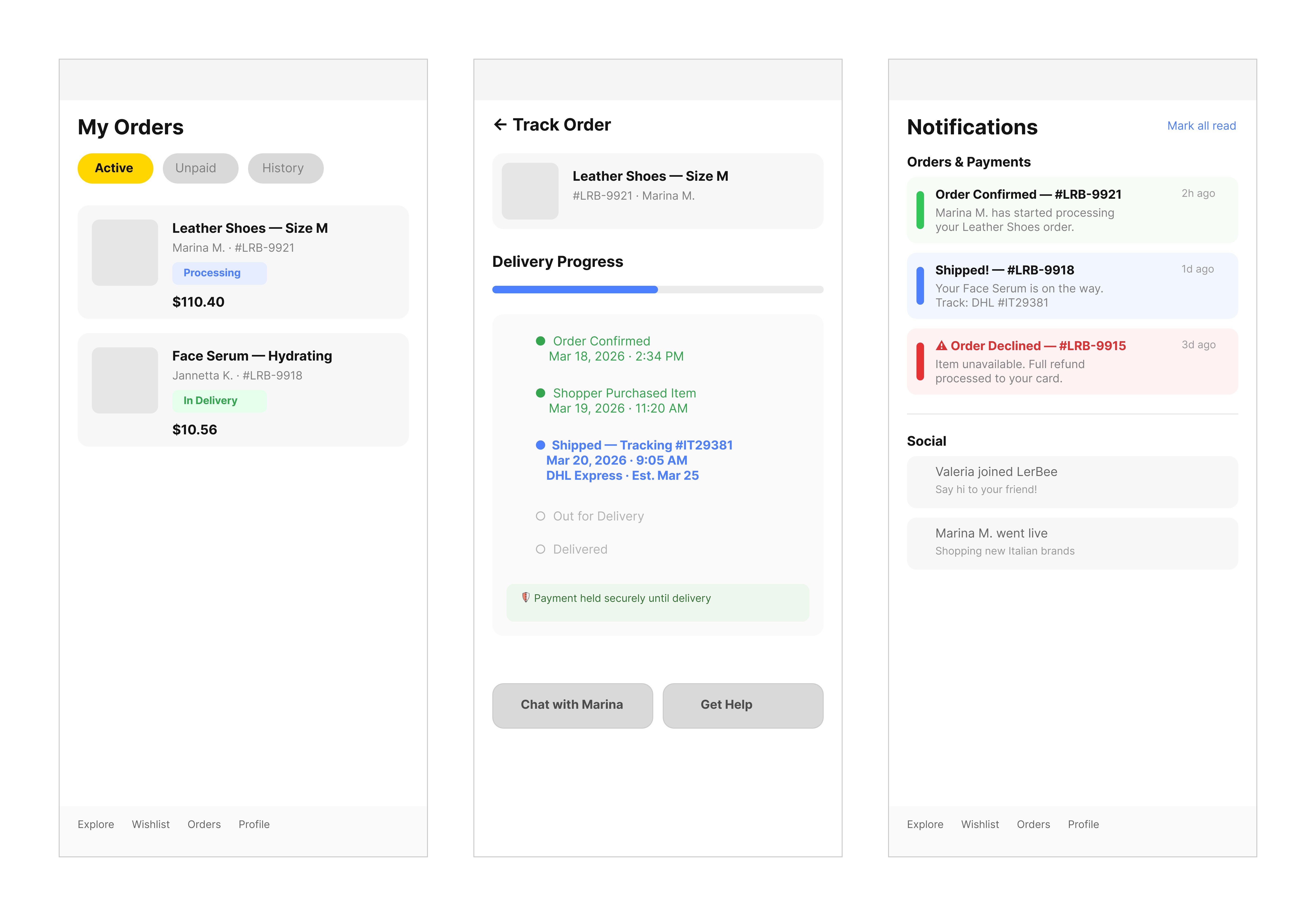
5. Order Tracking & Notifications — From Chaos to Structure
Before: A generic "We are processing your payment" message with no order details, no next step, no human language.
After: "Order Placed Successfully" with order number, product summary, delivery address, estimated timeline, and a direct link to chat with the shopper.
Order Confirmation — From Anxiety to Clarity
Before: Orders and packages split across different tabs with no explanation. Notifications mixed promotional noise with critical order updates — all with equal visual weight.
After: Orders and packages merged into one unified flow with clear status tabs (Active / Unpaid / History). Notifications split into two categories — Orders & Payments and Social — so users never miss what matters.